Author Branding 101: Choosing Colors, Fonts, and a Look That Fits Your Genre
Your visual identity is the first thing readers notice. Here's how to choose colors, fonts, and a design language that matches your genre and attracts your audience.
Before a reader opens your book, they see your cover. Before they visit your website, they see your social media profile. Visual branding is the first impression you make — and it happens in milliseconds.
Genre Sets the Tone
Your visual identity should signal your genre instantly. Readers are trained to recognize genre cues:
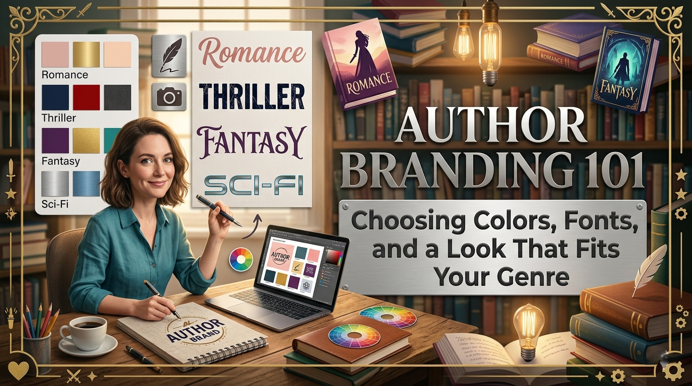
Romance — Warm pinks, golds, soft fonts, script lettering, floral elements
Thriller / Suspense — Dark backgrounds, red accents, bold sans-serif fonts, gritty textures
Fantasy — Rich purples and golds, ornate serif fonts, mythical imagery
Cozy Mystery — Bright colors, playful illustrations, friendly fonts
Literary Fiction — Minimalist design, muted earth tones, elegant serif fonts
Sci-Fi — Cool blues and neon accents, modern sans-serif fonts, tech-inspired elements
Pick Your Palette
Choose 2–3 colors and use them everywhere: website, social media headers, book marketing materials, newsletter templates. Consistency = recognition.
Start with your book covers. If your cover designer used specific colors, extend those to your online presence. Your website accent color should complement (not clash with) your covers.
Fonts Matter More Than You Think
You don't need to pick a custom font — but you do need to be consistent. Serif fonts (Georgia, Times) feel traditional and literary. Sans-serif fonts (Arial, Helvetica) feel modern and clean. Script fonts feel personal and romantic. Pick one primary font and stick with it.
Your Headshot Is Part of Your Brand
The same headshot should appear on your website, social media, email signature, and back cover. Get one professional photo and use it for at least a year. Different photos everywhere = no recognition.
Where to Apply Your Brand
Author website (theme, accent color, logo)
Social media profiles and headers
Newsletter templates
Book marketing graphics
Business cards and bookmarks
Media kit
AuthorLoft lets you customize your site's accent color and choose from genre-appropriate themes, so your brand is consistent from day one.
Author Visual Branding Guide
How to Build a Cohesive, Recognizable, Genre‑Aligned Author Brand
Introduction: Why Visual Branding Matters
Before a reader opens your book, they see your cover.
Before they read your bio, they see your headshot.
Before they visit your website, they see your social media profile.
Visual branding is the first impression you make—and it happens in milliseconds.
Readers make snap judgments based on color, typography, imagery, and tone. They decide whether you’re a professional, whether your work fits their taste, and whether they trust you enough to click, follow, or buy.
A strong visual brand does three things:
Signals your genre instantly
Builds recognition across platforms
Creates trust and credibility
This document walks you through the core elements of author branding—genre cues, color palettes, typography, photography, and application—so you can build a cohesive, professional identity that supports your books and your career.
1. Genre Sets the Tone
Your visual identity must match reader expectations
Readers are trained—consciously or not—to recognize genre cues. They know what a romance cover looks like. They know what a thriller feels like. They know the difference between cozy mystery and dark fantasy at a glance.
Your brand should align with these expectations. When your visuals match your genre, readers instantly understand what you write. When they don’t, readers feel confused—and confusion kills sales.
Below are the dominant visual cues for major genres.
Romance
Color palette: Warm pinks, golds, blush tones, soft neutrals
Typography: Script fonts, elegant serifs, soft curves
Imagery: Couples, silhouettes, florals, soft lighting
Mood: Emotional, intimate, warm, aspirational
Romance readers expect warmth and softness. Even if your romance is spicy, sweet, or dark, the brand should still feel emotionally driven and aesthetically inviting.
Thriller / Suspense
Color palette: Black, charcoal, deep blues, red accents
Typography: Bold sans‑serif fonts, sharp edges, high contrast
Imagery: Shadows, silhouettes, cityscapes, gritty textures
Mood: Tense, urgent, dangerous, high‑stakes
Thriller branding should feel like adrenaline. Readers want to sense danger before they read a single word.
Fantasy
Color palette: Rich purples, golds, emerald greens, deep blues
Typography: Ornate serif fonts, runic or medieval influences
Imagery: Mythical creatures, magical symbols, epic landscapes
Mood: Grand, mystical, immersive, otherworldly
Fantasy branding should transport readers into a world of magic and myth.
Cozy Mystery
Color palette: Bright pastels, cheerful yellows, soft blues
Typography: Friendly serif or rounded sans‑serif fonts
Imagery: Illustrated scenes, cats, teacups, small towns
Mood: Lighthearted, charming, playful, inviting
Cozy mystery branding should feel like a warm blanket and a cup of tea.
Literary Fiction
Color palette: Muted earth tones, minimalist neutrals
Typography: Elegant serif fonts, refined spacing
Imagery: Abstract shapes, minimal photography, symbolic elements
Mood: Thoughtful, introspective, sophisticated
Literary fiction branding should feel intentional and artful.
Science Fiction
Color palette: Cool blues, neon accents, metallics
Typography: Modern sans‑serif fonts, geometric shapes
Imagery: Futuristic tech, starscapes, digital patterns
Mood: Innovative, sleek, high‑concept
Sci‑fi branding should feel like a window into the future.
2. Pick Your Palette
Color is the fastest way to create recognition
Your color palette is the backbone of your visual identity. It should appear everywhere:
Website
Social media headers
Book marketing graphics
Newsletter templates
Business cards and bookmarks
Media kit
AuthorLoft site theme
How many colors should you choose?
2–3 primary colors
These are your signature colors—the ones readers will associate with you.
1–2 secondary colors
Used sparingly for accents, highlights, or seasonal variations.
Where to start
Begin with your book covers. Your covers are the most visible part of your brand, so your palette should complement them.
If your designer used:
Deep blues and gold → Use those on your website
Soft pinks and creams → Use those in your newsletter
Neon blues and blacks → Use those in your social media graphics
Color psychology for authors
Blue: Trust, calm, intelligence (great for sci‑fi, nonfiction, thrillers)
Red: Urgency, passion, danger (thrillers, romance, dystopian)
Gold: Prestige, magic, luxury (fantasy, romance)
Pink: Warmth, softness, emotion (romance, cozy)
Black: Power, mystery, sophistication (thrillers, literary)
Green: Nature, growth, magic (fantasy, historical)
Consistency = recognition
Readers should be able to glance at a graphic and think,
“Oh, that looks like one of Andy’s posts.”
That’s the power of a consistent palette.
3. Fonts Matter More Than You Think
Typography is subtle, but it shapes how readers perceive you
You don’t need a custom font. You don’t need to buy expensive typefaces. But you do need to be consistent.
Typography communicates tone:
Serif fonts (Georgia, Times, Garamond)
Traditional
Literary
Elegant
Serious
Sans‑serif fonts (Arial, Helvetica, Open Sans)
Modern
Clean
Minimalist
Professional
Script fonts (Great Vibes, Pacifico)
Romantic
Personal
Emotional
Soft
How many fonts should you use?
One primary font
Used for:
Website body text
Newsletter text
Social media captions
One secondary font
Used for:
Headers
Book marketing graphics
Pull quotes
Avoid using more than two fonts. Too many fonts = visual chaos.
Font pairing examples
Romance: Playfair Display (serif) + Great Vibes (script)
Thriller: Montserrat (sans‑serif) + Bebas Neue (bold sans‑serif)
Fantasy: Cinzel (ornate serif) + Lora (serif)
Cozy Mystery: Quicksand (rounded sans‑serif) + Merriweather (serif)
Sci‑Fi: Orbitron (tech sans‑serif) + Roboto (modern sans‑serif)
Where to apply your fonts
Website headings and body text
Social media quote graphics
Newsletter headers
Book trailers
Media kit
Author logo
Typography is one of the easiest ways to elevate your brand instantly.
4. Your Headshot Is Part of Your Brand
Readers connect with faces—make yours consistent
Your author photo is not just a picture. It’s a branding asset.
Readers want to know who you are. They want to feel a connection. They want to recognize you across platforms.
Why consistency matters
If you use:
One photo on your website
A different one on Instagram
A third one on your Amazon page
A fourth one on your newsletter
…readers won’t connect the dots.
A single, consistent headshot builds recognition and trust.
What makes a strong author headshot
Clean background
Good lighting
Neutral or genre‑appropriate colors
Confident but approachable expression
High resolution
Cropped for versatility (square, circle, banner)
How often to update
Use the same headshot for at least one year.
Update every 1–2 years or when your appearance changes significantly.
Where to use your headshot
Website “About” page
Social media profile pictures
Newsletter signature
Amazon Author Central
Goodreads author page
Media kit
Back cover of your book
Your face is part of your brand—use it intentionally.
5. Build a Cohesive Visual Identity
Your brand should feel unified across every platform
Once you’ve chosen your genre cues, palette, fonts, and headshot, it’s time to apply them consistently.
Below are the core places your brand should appear.
Author Website
Your website is your digital home base. It should reflect your brand instantly.
Elements to brand
Theme
Accent color
Header image
Fonts
Buttons and links
Book graphics
Newsletter signup section
Author photo
Pro tip
AuthorLoft lets you choose genre‑appropriate themes and customize your accent color so your brand is consistent from day one.
Social Media Profiles
Your social media should look like an extension of your website.
Branding elements
Profile photo (same headshot everywhere)
Header/banner image
Color palette
Fonts in graphics
Highlight covers (Instagram)
Post templates
What readers should feel
When they move from your Instagram to your website, it should feel seamless—like they’re still in your world.
Newsletter Templates
Your newsletter is your most valuable marketing asset. It should look like you.
Branding elements
Header graphic
Accent color
Font choices
Signature block
Section dividers
CTA buttons
Why it matters
Readers who subscribe are your warmest audience. A branded newsletter strengthens your relationship with them.
Book Marketing Graphics
Every graphic you post should reinforce your brand.
Examples
Cover reveals
Quote graphics
Character art
Launch announcements
Giveaway posts
ARC invitations
Branding elements
Your palette
Your fonts
Your tone
Your imagery style
Consistency builds recognition. Recognition builds trust. Trust builds sales.
Business Cards and Bookmarks
These are physical extensions of your brand.
Include
Your name
Your website
Your genre
Your palette
Your fonts
Your headshot (optional)
These materials should look like they belong to the same world as your books.
Media Kit
A media kit is essential for:
Interviews
Podcasts
Guest posts
Press coverage
Events
Branding elements
Logo or nameplate
Headshot
Color palette
Typography
Book covers
Author bio
Contact info
A polished media kit signals professionalism.
6. Creating Your Author Logo (Optional but Powerful)
A simple nameplate can elevate your brand
You don’t need a complex logo. Most authors use a nameplate—a stylized version of their name.
What makes a good author logo
Clean typography
Genre‑appropriate style
High contrast
Works in black and white
Scales well (favicon → banner)
Examples
Romance: Script + serif
Thriller: Bold sans‑serif
Fantasy: Ornate serif
Sci‑Fi: Geometric sans‑serif
Use your logo on:
Website header
Newsletter header
Social media banners
Book trailers
Media kit
7. Building a Brand Style Guide
Your brand should be documented so you can repeat it consistently
A style guide is a simple document that outlines your brand rules. It ensures consistency across every platform and every piece of content.
Your style guide should include:
1. Genre positioning
Your genre
Your subgenre
Your tone
Your target reader
2. Color palette
Hex codes
Primary colors
Secondary colors
Usage examples
3. Typography
Primary font
Secondary font
Header style
Body text style
4. Imagery
Mood
Themes
Photography vs. illustration
Do’s and don’ts
5. Headshot
Approved photo
Cropping guidelines
Usage examples
6. Logo
Approved versions
Spacing rules
Color variations
7. Applications
Website
Social media
Newsletter
Marketing graphics
Print materials
Media kit
This document becomes your branding bible.
8. Step‑by‑Step: Build Your Brand in One Week
Here’s a simple, actionable plan.
Day 1: Define your genre identity
Identify your primary genre
Identify your subgenre
Study the top 20 covers in your category
Note common colors, fonts, and imagery
Day 2: Choose your color palette
Pick 2–3 primary colors
Pick 1–2 secondary colors
Test them against your book covers
Day 3: Choose your fonts
Select one primary font
Select one secondary font
Create sample graphics to test readability
Day 4: Get or update your headshot
Choose a clean background
Wear brand‑appropriate colors
Take multiple shots with good lighting
Day 5: Create your logo/nameplate
Use your chosen fonts
Keep it simple
Test it in small and large sizes
Day 6: Apply your brand to your website
Update colors
Update fonts
Update header images
Add your headshot
Day 7: Apply your brand everywhere else
Social media
Newsletter
Marketing graphics
Media kit
By the end of the week, you’ll have a cohesive, professional brand.
Conclusion: Your Brand Is a Promise
Your visual brand is more than colors and fonts. It’s a promise to your readers—a promise about the kind of stories you tell, the emotions you evoke, and the experience they can expect.
A strong brand:
Attracts the right readers
Builds trust
Creates recognition
Supports every book you publish
Whether you’re writing romance, thrillers, fantasy, cozy mystery, literary fiction, or sci‑fi, your brand should feel like an extension of your storytelling.
And with tools like AuthorLoft, you can implement your brand consistently from day one.
· Ready to take back control? ·
Own your author business starting today
Keep 100% of every sale and own every reader relationship — no middleman.
Get Started Free